Mindblowing Stories Behind 10 World Famous Tech Logos
Often the logo and its birth is associated with a tale, which could be no less than a legend, and ends up arising curiosity about its origin.
Read on to know tales behind logos of ten companies
 #10 Microsoft:
The word ‘Microsoft’ was for the first time mentioned by Bill Gates to co-founder Paul Allen in 1975, but it was written as ‘Micro-Soft’, which was an amalgamation of ‘microcomputers’ and ‘software’.
Taking off the hyphen, ‘Microsoft’ was officially registered as a company on Nov. 1976 with the first logo as
Microsoft has changed logo several times, in 1987 it adopted the ‘Pac-Man’ logo, but previously it was ‘blibbet’ logo, which represented stylized “o” and it was apparently once the name of burger served in company cafeteria.
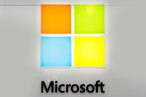
The present logo of Microsoft was unraveled on Aug. 2012, which is just a simplified version of Windows logo, with same four colors: Blue, Orange, Green and Yellow, but it is in simple square blocks than wavy. The wordings changed to Segoe font than italicized, which the company uses in its products and marketing materials for many years now. The thing which is unchanged is the connection between letters ‘f’ and‘t’.
In Aug 2012, Microsoft unveiled its updated logo which is essenially a simplified version of the Windows logo. The Windows logo had the four colors, Blue, Orange, Green and Yellow in the form of a wave. However with the Microsoft logo, they are simple square blocks. In addition, the Microsoft font is no longer italicized but a simpler lighter type font. The font is the Segoe font, which is a font that Microsoft had created and uses in its products and marketing materials for many years. The font apparently figures prominently in the new Windows 8 interface as well. The one element that they have retained from the previous logo is the connection between the letters 'f' and 't'.