Mindblowing Stories Behind 10 World Famous Tech Logos
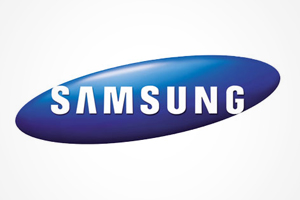 #6 Samsung:
Lee Byung-chull founded the company in 1938, and was known as Samsung Sanghoe, a small trading company at that time. Samsung in Korean means ‘three stars’ and the word symbolizes ‘big, numerous and powerful’ and star means ‘eternity’. The very first logo, also known as the Samsung Byeolpyo noodles logo, had a circle in centre with three stars and the name of the company was spelt out within the circle in Korean.
The logo has Samsung written in English, within elliptical shape which is of blue color.
‘Samsung’ in English indicates the company’s wishing to reach out to whole world. Elliptical shape symbolizes the world moving through space, indicating a unique image of innovation and change. The first letter ‘S’ and last letter ‘G’ partially break out of ellipses to connect the interior with exterior, showing the company’s desire to be one with the world and serve society as whole.
The logo also defines ‘simplicity and flexibility’, the bold letters ‘SAMSUNG’ symbolizes ‘ commitment, leadership and innovation.’ The letter ‘A’ in the logo looks like inverted ‘V’ which attracts once attention and blue color indicates ‘stability and reliability’