Mindblowing Stories Behind 10 World Famous Tech Logos
 #5 Nokia:
The Nokia Company started as a groundhood pulp mill in 1865 by Fredrik Idestam in a Finnish town by name ‘Nokia’, since than it is evolved through different venture to become one of the leading mobile company.
First logo of Nokia had a fish leaping from a circular ring with company’s name running along circumference, may be indicating Solomon fish which were found in a river Nokianvirta by its factory.
Before 1966, Nokia was a Finnish rubber company with business interests in electrical and paper industry. At this time company adopted a logo, which was a inverted diamond outline containing company’s name in red color with date of its foundation.
In 1966, the three businesses are merged forming Nokia Corp. and a new logo too adopted, which was just a black circle with a line where Nokia was written in white. The circle symbolized ‘globe’ and company’s name at the center indicated its ambition to expand beyond Finland and Europe.
After becoming a telecom company in 1967, Nokia got a new logo, which had Nokia spelt in aqua blue color, and top of ‘A’ had three arrows symbolizing company’s progress.
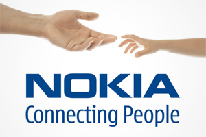
Nokia’s current logo is adopted in 2006, with slogan ‘Connecting People’ which obviously indicates its telecom business where people are connected.