

Unique Typefaces: Identity Of Cities
Eindhoven — Eindhoven
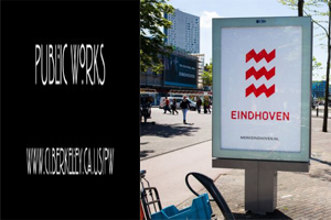
This font originated from a change in the logo Eindhoven the zig zagged lines parallel to each other was supported with the font to match. Originally it was made out by a tape to give it an unfinished look, where you can see the ends being incomplete.
Stockholm — Stockholm Type
2014, the design agency Essen International was tasked with giving the Swedish city a whole new look
This Swedish city was given in to the hands of Essen International to give it a whole new look in 2014, what it came out was unparalleled. The St. Erik, Stockholm's patron saint was given a makeover and it came so dear to them as to be displayed all over the city.
 Minneapolis and St. Paul — Twin
The competition held out for four design firms back in 2003 to design a new municipal typeface though a flop, but was a step towards inspiring another firm of Dutch LettError. Most of the fonts were seen only in three styles (bold, italic or light etc) but this one was strew out in ten different styles. The unique sense of this font is that it transforms its style depending on the weather your city has when displayed on large screens.
Berkeley — Rennie Mackintosh
Of all the others a glance will give out a dicey approach of its way through alphabets, named after Rennie Mackintosh the artist and a crucial figure of Art Nouveau movement in the U.K. The font was in use since 1996 by him though popularly known after him, it was not him that made it.
Read Also:
Indian Army Honours Martyrs Of Kashmir Gunfight
Govt To Soon Bring Transparency In Green Public Procurement


