

Mindblowing Stories Behind 8 Famous Brand Logos
#3.Carrefour
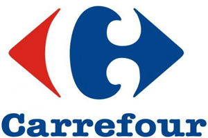 It is one of the biggest European retailers, headquartered in France. The Carrefour logo is designed by Miles Newlyn; it displays two arrows pointing left and right which reflect the exact meaning of the French word “carrefour,” meaning “crossroads”. In a more symbolic perceptive, it can be also understood as the multiple choices of products offered by this supermarket chain. In addition to it, there is a negative space letter “c” located in between the arrows and the use of the colors of the French flag from where Carrefour was founded.
#4.FedEx
FedEx is an American global courier delivery services company, headquartered in Memphis, Tennessee. FedEx’s logo was designed by Lindon Leader, there is not much hidden meaning to the arrow, and it simply means the direction, speed, precision that represents the core values of FedEx.
#5.Le Tour de France
Le Tour de France is an annual multiple stage bicycle race primarily held in France, which was first staged in 1903. The logo features two hidden messages; the first message is that it has a cyclist that’s shaped as the letter “R”, the “U,” and the yellow-orange circle serving as the bicycle. The second message is that the wheel, a yellow circle, serves as a symbol for the sun which represents the summer season in which the race is being held.
READ MORE: Smokers Pay More: ITC Raises Cigarette Prices By Up To Rs 10 Per Pack
71Percent Auditors See Rising Financial Risks For Companies: Pwc


