Mindblowing Stories Behind 10 World Famous Tech Logos
 #3 IBM:
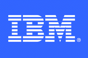
International Business Machines (IBM). In 1956 designer Paul Rand came up with first logo, which was solid block letters ‘IBM’ in City Medium font.
In 1967, IBM sported a new logo after launching its Disk drive storage system. The logo was flashy, and had thirteen trips, the masthead was solid black bar, and letters were in silver. The logo seemed too flashy and less of symbolism, and was not a popular logo at that time. The company had to come up with new logo, which should be welcomed happily without fuss, and which resulted in the logo which is presently used.
In 1972 the IBM international recognition logo was adopted and it remains unchanged till date. The logo can be easily identified by its distinctive eight strips that make ‘IBM’ letters and is often called eight stripper logo for short. The font color is blue.
The logo represents signature style of company, where it symbolizes—trust, value, quality and advanced technology. And in the world of IT system the logo represents, authenticity, reliability, and quality of brand, and its functioning.