
The origin of some famous tech firms' logos
By siliconindia
|
Tuesday, 10 November 2009, 15:06 IST

Bangalore: The logos of the largest tech firms are some of the most recognizable brands in the world. But where do the logos come from? And what do they mean? The history behind some of tech world's most recognizable corporate images are revealed by Techradar.com.
Adobe Systems
Adobe was founded in late 1982 by John Warnock and Charles Geschke. Both worked for Xerox PARC and wanted to develop PostScript - the first major step towards the desktop publishing revolution. The name came from Adobe Creek in Los Altos, California. The fledgling company didn't have much money and employed all means possible to save it - Geschke's 80-year-old father prepared shelving for their office, while Marva Warnock (John's wife) designed the company logo.
 Doug Brotz, also from Xerox and Adobe's fourth staffer, said: "Of all the companies that came out of PARC, I thought that this one was guaranteed to fail." But after PostScript, Adobe Illustrator appeared with Photoshop following in 1989. The second logo shows a progression from the original while retaining some of the "A" characteristics.
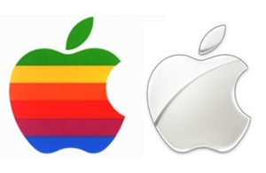
 Apple
Most people think the original Apple logo was the striped Apple, but they'd be wrong. It was the intriguing black-and-white Isaac Newton 1976 design. It was drawn by Ronald Wayne, often described as the 'Third Founder' of Apple. He gave up his 10 percent share in the company for just $800 after only two weeks, as he didn't want to get saddled with debt.
Apple
Most people think the original Apple logo was the striped Apple, but they'd be wrong. It was the intriguing black-and-white Isaac Newton 1976 design. It was drawn by Ronald Wayne, often described as the 'Third Founder' of Apple. He gave up his 10 percent share in the company for just $800 after only two weeks, as he didn't want to get saddled with debt.
 Co-founder Steve Jobs was worried that the logo wasn't helping the slow sales of the Apple I. Rob Janoff of the Regis McKenna agency was employed and came up with the iconic logo, which was refreshed as the monochrome logo we have today in the late 1990s. Interestingly, rumor has it that the bite out of the Apple is in homage to Alan Turing, a forefather of Computer Science who committed suicide by eating a cyanide-laced apple, but Janoff says he was swayed by the bite/byte concept.
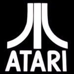
 Atari
While some might think the Atari logo is supposed to look like an "A", it actually is designed to replicate Mount Fuji. Indeed the logo was known as the 'Fuji.' Atari Founder Nolan Bushnell was a fan of the ancient strategy game Go, played on the lower slopes of the mountain.
Atari
While some might think the Atari logo is supposed to look like an "A", it actually is designed to replicate Mount Fuji. Indeed the logo was known as the 'Fuji.' Atari Founder Nolan Bushnell was a fan of the ancient strategy game Go, played on the lower slopes of the mountain.
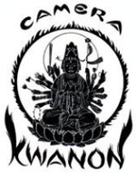
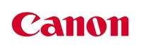
 Canon
Precision Optical Instruments Laboratory changed name several times before it became Canon Camera Company in 1947. The original Kwanon brand was never released.
Canon
Precision Optical Instruments Laboratory changed name several times before it became Canon Camera Company in 1947. The original Kwanon brand was never released.
 And like many other old brands, Canon hasn't changed its logo for years - the version still in use today was designed in 1955 though a similar design had been used since 1953. Interestingly, the sharpened "C" was bespoke and didn't exist in any standard typefaces.
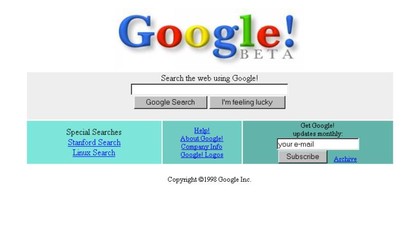
 Google
Stanford University graduates Larry Page and Sergey Brin renamed their BackRub search engine as Google, a play on the word Googol (1 followed by 100 zeros). Brin created the first logo using GNU Image Manipulation Program (GIMP) before an exclamation mark was added to the design echoing a certain other search engine with a funny name.
Google
Stanford University graduates Larry Page and Sergey Brin renamed their BackRub search engine as Google, a play on the word Googol (1 followed by 100 zeros). Brin created the first logo using GNU Image Manipulation Program (GIMP) before an exclamation mark was added to the design echoing a certain other search engine with a funny name.
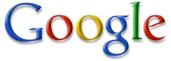
 The still-used and instantly recognizable logo of today was created in 1999 by Stanford Consultant Art Professor Ruth Kedar. "There were a lot of different color iterations," says Kedar in David Vise's The Google Story. "We ended up with the primary colors, but instead of having the pattern go in order, we put a secondary color on the L, which brought back the idea that Google doesn't follow the rules." The guy who designs the Google Doodles is Dennis Hwang.
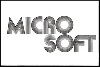
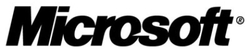
 Microsoft
In 1975 Bill Gates and Paul Allen called their partnership "Micro-soft" and came up with the first logo for the future software giant.
Microsoft
In 1975 Bill Gates and Paul Allen called their partnership "Micro-soft" and came up with the first logo for the future software giant.
 As Microsoft aggressively marketed MS DOS in the early 1980s, it came up with the second logo - the one with the striped "O". Colloquially at Microsoft, it was known as the "Blibbet."
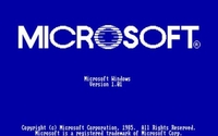 In 1987 Scott Baker morphed the logo into today's Microsoft logo with its slashed "O" instead. On a 2005 blog page, Microsoft employee Larry Osterman reminisces: "When Microsoft announced that it would be retiring the blibbet, a number of employees mounted a fruitless 'Save the Blibbet' campaign to retain the corporate icon. Unfortunately, the suits won. "Apparently the slash between the "o" and the "s" is designed to accentuate the "soft" part of the name.
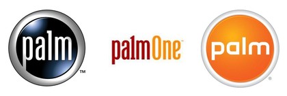
 Palm
Quite a history lies behind Palm. Established in 1992, U.S. Robotics bought it, who were in turn bought by 3com before it was spun off. The company then split and palmOne was then the name of the hardware arm. In between, the Founder Jeff Hawkins left to start Handspring.
Handspring and palmOne then merged and bought the operating system side of the business back. It's now just plain old Palm. The upshot of the upheaval is that the company had three different logos over the course of three years 2003-2005. Palm says its latest logo is designed to reflect the brand equity still remaining in the blue logo, while updating the typeface to one more suitable for the digital age.
Palm
Quite a history lies behind Palm. Established in 1992, U.S. Robotics bought it, who were in turn bought by 3com before it was spun off. The company then split and palmOne was then the name of the hardware arm. In between, the Founder Jeff Hawkins left to start Handspring.
Handspring and palmOne then merged and bought the operating system side of the business back. It's now just plain old Palm. The upshot of the upheaval is that the company had three different logos over the course of three years 2003-2005. Palm says its latest logo is designed to reflect the brand equity still remaining in the blue logo, while updating the typeface to one more suitable for the digital age.
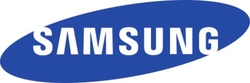
 Samsung
The 1993 rebranding of Samsung was designed as a new era for the company - one that has seen the Korean giant become one of the world's biggest consumer electronics companies. The elliptical design is supposed to symbolize the world moving through space. According to the company, "The first letter, 'S,' and the last letter, 'G,' partially break out of the oval to connect the interior with the exterior, showing Samsung's desire to be one with the world and to serve society as a whole."
Samsung
The 1993 rebranding of Samsung was designed as a new era for the company - one that has seen the Korean giant become one of the world's biggest consumer electronics companies. The elliptical design is supposed to symbolize the world moving through space. According to the company, "The first letter, 'S,' and the last letter, 'G,' partially break out of the oval to connect the interior with the exterior, showing Samsung's desire to be one with the world and to serve society as a whole."
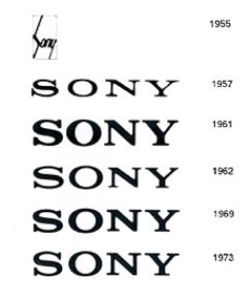
 Sony
One of the most recognizable brands in the world, the Sony logo was originally encased inside a square in 1955. But by the 1960s it had broken out and began its gradual modification to the design we still see today. In 1961 Sony Designer Yasuo Kuroki was asked to work on a new version of the logo in order for it to be displayed in neon in Hong Kong that year and by 1962 Sony had even come up with corporate identity rules for the use of the logo. Today's version dates back to 1973. In 1981 a change was proposed, but it never happened.
Sony
One of the most recognizable brands in the world, the Sony logo was originally encased inside a square in 1955. But by the 1960s it had broken out and began its gradual modification to the design we still see today. In 1961 Sony Designer Yasuo Kuroki was asked to work on a new version of the logo in order for it to be displayed in neon in Hong Kong that year and by 1962 Sony had even come up with corporate identity rules for the use of the logo. Today's version dates back to 1973. In 1981 a change was proposed, but it never happened.
Apple
Most people think the original Apple logo was the striped Apple, but they'd be wrong. It was the intriguing black-and-white Isaac Newton 1976 design. It was drawn by Ronald Wayne, often described as the 'Third Founder' of Apple. He gave up his 10 percent share in the company for just $800 after only two weeks, as he didn't want to get saddled with debt.
Co-founder Steve Jobs was worried that the logo wasn't helping the slow sales of the Apple I. Rob Janoff of the Regis McKenna agency was employed and came up with the iconic logo, which was refreshed as the monochrome logo we have today in the late 1990s. Interestingly, rumor has it that the bite out of the Apple is in homage to Alan Turing, a forefather of Computer Science who committed suicide by eating a cyanide-laced apple, but Janoff says he was swayed by the bite/byte concept.
Atari
While some might think the Atari logo is supposed to look like an "A", it actually is designed to replicate Mount Fuji. Indeed the logo was known as the 'Fuji.' Atari Founder Nolan Bushnell was a fan of the ancient strategy game Go, played on the lower slopes of the mountain.
Canon
Precision Optical Instruments Laboratory changed name several times before it became Canon Camera Company in 1947. The original Kwanon brand was never released.
And like many other old brands, Canon hasn't changed its logo for years - the version still in use today was designed in 1955 though a similar design had been used since 1953. Interestingly, the sharpened "C" was bespoke and didn't exist in any standard typefaces.
Google
Stanford University graduates Larry Page and Sergey Brin renamed their BackRub search engine as Google, a play on the word Googol (1 followed by 100 zeros). Brin created the first logo using GNU Image Manipulation Program (GIMP) before an exclamation mark was added to the design echoing a certain other search engine with a funny name.
The still-used and instantly recognizable logo of today was created in 1999 by Stanford Consultant Art Professor Ruth Kedar. "There were a lot of different color iterations," says Kedar in David Vise's The Google Story. "We ended up with the primary colors, but instead of having the pattern go in order, we put a secondary color on the L, which brought back the idea that Google doesn't follow the rules." The guy who designs the Google Doodles is Dennis Hwang.
Microsoft
In 1975 Bill Gates and Paul Allen called their partnership "Micro-soft" and came up with the first logo for the future software giant.
As Microsoft aggressively marketed MS DOS in the early 1980s, it came up with the second logo - the one with the striped "O". Colloquially at Microsoft, it was known as the "Blibbet."
In 1987 Scott Baker morphed the logo into today's Microsoft logo with its slashed "O" instead. On a 2005 blog page, Microsoft employee Larry Osterman reminisces: "When Microsoft announced that it would be retiring the blibbet, a number of employees mounted a fruitless 'Save the Blibbet' campaign to retain the corporate icon. Unfortunately, the suits won. "Apparently the slash between the "o" and the "s" is designed to accentuate the "soft" part of the name.
Palm
Quite a history lies behind Palm. Established in 1992, U.S. Robotics bought it, who were in turn bought by 3com before it was spun off. The company then split and palmOne was then the name of the hardware arm. In between, the Founder Jeff Hawkins left to start Handspring.
Handspring and palmOne then merged and bought the operating system side of the business back. It's now just plain old Palm. The upshot of the upheaval is that the company had three different logos over the course of three years 2003-2005. Palm says its latest logo is designed to reflect the brand equity still remaining in the blue logo, while updating the typeface to one more suitable for the digital age.
Samsung
The 1993 rebranding of Samsung was designed as a new era for the company - one that has seen the Korean giant become one of the world's biggest consumer electronics companies. The elliptical design is supposed to symbolize the world moving through space. According to the company, "The first letter, 'S,' and the last letter, 'G,' partially break out of the oval to connect the interior with the exterior, showing Samsung's desire to be one with the world and to serve society as a whole."
Sony
One of the most recognizable brands in the world, the Sony logo was originally encased inside a square in 1955. But by the 1960s it had broken out and began its gradual modification to the design we still see today. In 1961 Sony Designer Yasuo Kuroki was asked to work on a new version of the logo in order for it to be displayed in neon in Hong Kong that year and by 1962 Sony had even come up with corporate identity rules for the use of the logo. Today's version dates back to 1973. In 1981 a change was proposed, but it never happened.