 Magazine :
Google Unveils Redesigned 'G' Logo Reflecting AI-Centric Future
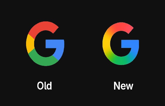
- Google is rolling out a redesigned version of its iconic ‘G’ logo, marking the first significant update in nearly a decade.
- The updated logo transitions from solid red, yellow, green, and blue blocks to a seamless gradient effect.
- Given Google’s AI-focused direction, similar gradient design updates may extend to other services in the future.
Google is rolling out a refreshed version of its iconic ‘G’ logo, marking the first major update in nearly a decade. The redesigned icon replaces the traditional solid red, yellow, green, and blue segments with a smooth gradient effect that transitions seamlessly between the colors. This subtle visual change is part of Google’s broader strategy to present a more modern, AI-focused identity.
According to 9to5Google, the updated logo has begun appearing for iOS users via the Google Search app and is also visible on some Android devices running the beta version 16.18 of the Google app. Although the change may go unnoticed at smaller sizes, it reflects a deliberate shift in Google's design language, aligning with its increasing focus on artificial intelligence across products.
The main Google wordmark remains unchanged for now, and there’s no official word on whether other prominent product logos such as Chrome, Maps, or Gmail will follow suit. However, with AI becoming central to Google's offerings, it's likely the gradient design could extend to other services in the near future.
Currently, the redesigned ‘G’ is visible on iOS and Google Pixel devices, while the older version is still used on the web and non-Pixel Android phones. A wider rollout is expected in the coming weeks, signaling a new visual era for one of the world’s most recognized technology brands.
Read More News :
India Rolls Out e-Passports to Boost Security and Global Travel Efficiency
Tata Steel to Infuse $2.5 Billion in Singapore Arm for Europe Push


.jpg "Top Companies of the Year")