


News >> Technology >>
Anil Kandangath, the winner of Google's DataVizChallenge
By siliconindia
|
Wednesday, 20 April 2011, 00:36 IST

When you pay your taxes have you ever wondered where it is going? Have you thought how government spends the enormous taxes that it has collected from us? Well these are the most common questions popping up in a tax payers mind. But here is an application which will not only tell you how much tax you paid but also shows how the government has made use of each of your hard earned money.
Anil Kandangath , who won the contest of in Google's DataVizChallege has developed an application "Where Did My Tax Dollars Go?" which illustrates users' personal contributions to the U.S. federal budget through a combination of text and charts and interactive elements that work together to create, a narrative arc. He also won an award of $5,000.
In February,Google challenged its users for a contest "Can you make tax data exciting?" In answer to this, Google got about 40 projects which were through video, graphic and text proving the point that it was possible to make tax data exciting.
The data was provided to the participants from whatwepayfor.com. All that they needed was a creative way to present the data that could turn information into understanding.
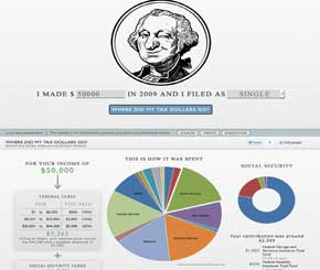 Anil Kandangath's "Where Did My Tax Dollars Go?" breaks down federal tax contributions to show the major areas where they were spent. It also shows you how your taxes were calculated using tax brackets.
He built the project itself using Ruby on Rails, which is a Web application framework optimized for sustainable programming productivity; for the images, he used Highcharts, a web-based solution for high quality, interactive graphing and charting data and Javascript graphics library which produces graphical plots of arbitrary datasets on-the-fly client-side. He also brought an engineer's precision to the aesthetic elements of the narrative graphic.
But what clicked Kandangath's project was accessibility and elegance. Not only was Kandangath's "winky Washington" interactive, with its narrative progression and use of varying graphics categories, almost intuitively understandable; it also managed to be comprehensive without being overwhelming.
Anil Kandangath's "Where Did My Tax Dollars Go?" breaks down federal tax contributions to show the major areas where they were spent. It also shows you how your taxes were calculated using tax brackets.
He built the project itself using Ruby on Rails, which is a Web application framework optimized for sustainable programming productivity; for the images, he used Highcharts, a web-based solution for high quality, interactive graphing and charting data and Javascript graphics library which produces graphical plots of arbitrary datasets on-the-fly client-side. He also brought an engineer's precision to the aesthetic elements of the narrative graphic.
But what clicked Kandangath's project was accessibility and elegance. Not only was Kandangath's "winky Washington" interactive, with its narrative progression and use of varying graphics categories, almost intuitively understandable; it also managed to be comprehensive without being overwhelming.
