

5 ways Windows 8 beats iOS and Android
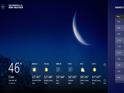 4. The “Chromeless” full-screen app experience: The whole OS is designed like the Metro interface that was introduced in the Windows 7 phones. The interface on the OS is stripped of “chrome”, i.e. all those busy interface elements that can trash a desktop or app interface are all gone. There are no menu bars, task bars or even navigational buttons which are permanently pinned to the display. Now icons such as the battery signal (which indicates the charge on your device), time, navigational buttons and other icons that link to other information are all done away with. When you are using an app, you are given access to the full-screen app, so that your activity is not interrupted by such icons. You can check the time when you want to, or check out other apps at a whim.
This is another way the Windows 8 OS beats the iOS and Android—they have these icons pinned to the user interface no matter what app you are on.
A number of iOS apps have the navigational buttons persist across the app's entire user experience. And even apps that don't do this have a thin bar at the top of the screen showing data connection strength, the time, and other things. These icons are permanently locked to the iOS home display.
In the case of the Android Ice Cream Sandwich there are three virtual navigation buttons at the bottom of the screen that persist all over the UI. Most of the time there is also a bar across the top of the screen (which mimics the iOS screen) in addition to the buttons at the bottom of the screen.


